A gentle introduction to Pandas with Python

I made this presentation for a PyZürich meetup. It serves as a brief introduction to loading and processing data with Pandas, the open source Data Analysis Library for Python. You can get a copy of the iPython notebook and the open data used here: http://bit.ly/pyzurich-04092014
Also check out Felix Zumstein’s notebook and presentation on xlwings, which followed this demo as a real world example of Python data analytics with Excel integration.
The best way to use this tutorial is interactively, editing the examples and writing your own. For this you’ll need to set up your environment, and thankfully this is easy no matter if you are on a Mac, Windows or Linux computer. Please leave a note on Twitter if you get stuck or have feedback.
Setting up
I find that getting started with powerful data analytics in Python is easiest with a download and installation of Anaconda from Continuum Analytics. Just download the file and run it:
$ bash Anaconda-2.0.1-Mac-x86.sh
$ ipython notebook
(..or equivalent on Linux / double click the executable on Windows)
If you want to have virtualenv-like control over your installation and use up less hard drive space*, use Miniconda:
$ conda create -n my_pandas python=2 pandas
... Proceed ([y]/n)? y ...
$ source activate my_pandas
(my_pandas)$ conda install ipython pyzmq tornado jinja2 matplotlib
(my_pandas)$ ipython notebook
* If you have multiple projects, you do not need to create separate environments for each of them.
If you’re on Windows, a popular free alternative is Python(x,y).
First chirps
OK, you’ve got your data analytics toolkit deployed. You’ve started ipython notebook and should now see a web page open up called IPy: Notebook. Click on the New Notebook button, or navigate to a copy of this notebook that you downloaded, and you’ll be set to try this out for yourself. Another popular way of exploring Python is ReInteract.
Let’s start off by making some pretty graphics with the Matplotlib library. If you have ever used R, MATLAB or Mathematica, using this might feel familiar. This package tries to make data plotting as painless as possible, and comes with no strings attached. If you want more control over your graphics, check out the list of Plotting libraries on python.org. We are going to now add Matplotlib and its external links to our environment, then draw a chart from some open data.
%matplotlib inline
%matplotlib qt, if you prefer and your system supports them. Also note, that to some people this reliance on external dependencies is exactly the reason why some people choose to not use Matplotlib, as it makes your code less portable. Pick your battles.Now we import into our namespace:
import matplotlib.pyplot as plt
import numpy as np
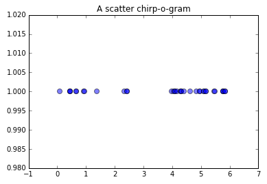
birdsong_data = [0.080000, 0.444000, 0.448000, 0.449000, 0.667000, 0.670000, 0.932000, 0.938000, 1.384000, 2.338000, 2.428000, 2.434000, 3.979000, 4.043000, 4.094000, 4.100000, 4.174000, 4.301000, 4.303000, 4.311000, 4.421000, 4.631000, 4.833000, 4.961000, 4.965000, 5.094000, 5.097000, 5.178000, 5.183000, 5.473000, 5.478000, 5.766000, 5.767000, 5.772000, 5.841000, 5.843000]
birdsong = np.array(birdsong_data)
plt.scatter(birdsong, [1]*len(birdsong), s=50, alpha=0.5)
plt.title('A scatter chirp-o-gram')
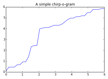
Or in linear space (read: line graph) using the ubiquitous plot function.
x = np.linspace(0, 6, len(birdsong))
plt.plot(x, birdsong)
plt.title('A simple chirp-o-gram');
And that’s like the little snow-heap at the top of the iceberg of the kinds of charts you can do with Python. Then again, if you’re planning to publish your data on the Web a better option might be to use something like D3.js or Raphael.js for crispness and interactivity. It still makes sense to explore your data in a powerful environment first, ensuring your data is clean and your approach to visualizing and explaining it rock solid.
Let’s go for another example.
Velo flows
You can get readings of traffic measured as bikes pass through special lanes in the neat collection Daten der permanenten Velozählstellen. This data has already been explored by my esteemed colleague Dr. Ralph Straumann using R in a series of blog posts: Teil 1, Teil 2, Teil 3. We’re not going to go into as much detail here, but let’s see how Python with Pandas compares for processing these 30 MB of open data in CSV format.
Start by importing Pandas as we did with Matplotlib:
import pandas as pd
bike_data = pd.read_csv('/opt/localdev/SciPy/data/TAZ_velozaehlung_stundenwerte.csv')
# Equivalent to bike_data[-6:-1]
# For the top 5 use bike_data.head(5)
bike_data.tail(5)
There are some handy functions to get a feeling for the data before digging in:
bike_data.describe()
bike_data['Stunde'].median()
bike_data['Zählstelle (Code)'].unique()
Pandas interacts well with Matplotlib, as we shall see next:
pd.options.display.mpl_style = 'default' # the 'look nicer' option
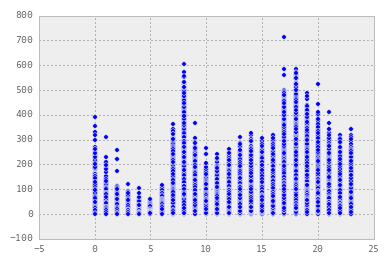
plt.scatter(bike_data['Stunde'], bike_data['Gezählte Velofahrten'])
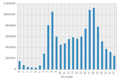
Here is an actual histogram of actual counts using the plot() function through the DataFrame itself:
bike_data.groupby(['Stunde'])['Gezählte Velofahrten'].sum().plot(kind='bar')
hist() function:fig = bike_data['Gezählte Velofahrten'].hist(by=bike_data['Zählstelle (Code)'], grid=False, figsize=(26,26))

Last words
For more knowledge on data exploration in Python, have a look at some of these links for additional references:
..and helpful tutorials:
- Introduction to Pandas Data Structures
- Introduction to Python and Pandas Data Munging and Machine Learning
- Baby Steps Performing Exploratory Analysis with Python
- Beautiful Plots with Pandas and Matplotlib
Some more notebooks like this one:
